|
My best artwork is my motor home because I learned so much and had a lot of fun making it. My dad loves his motor home, and it was just over all so much fun. If I could redo an artwork I would probably redo the sphere because I feel like I could have done something more unique. I learned that it takes a lot of patience to make art. I wish we could have used the wheel.
0 Comments
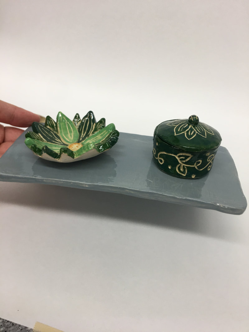
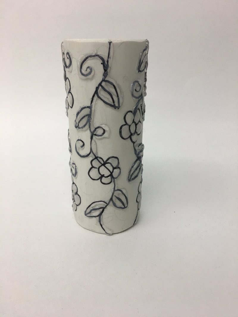
My art work is a flower dish to hold rings, a little circle pot to hold earrings, and a shelf to hang necklaces. The flower is all sorts of underglazes the names are teal blue, medium blue, and hunter green. I mixed the colors all around to make different colors. The little pot is the same color, it has a vine, flower and a leaf design throughout the pot. The shelf is just a plain color, the glaze I used was blue gray. I didn't want the shelf to be too colorful because my color pieces will be sitting on it. So I didn't want it to be to much color. My multiple set is functional and decorative, it goes together because the shelf holds my other two pieces. I made my art out of white clay. I painted underglaze on the pot and flower. Then I used sgraffito to crave out what I wanted. My artwork was inspired by my wall of necklaces in my room and images I searched up on google. (which are in one of the slide shows.) Also ignore the hand in some of the photos. I wanted better angles. They are all just hanging on tacks. It is really ugly so I wanted to make a functional shelf to hold all my necklaces. My goal as an artist is to make artwork that I like and I can use. I also want it to look nice. This piece helped reach my goals because it is functional and I like it. When creating my artwork I learned that underglaze doesn't also look the same as it does before its fired. My final piece is exactly how I imagined but the underglaze is a little darker and less detailed. I think that these piece will influence future artworks because I like making cute little pottery artworks.
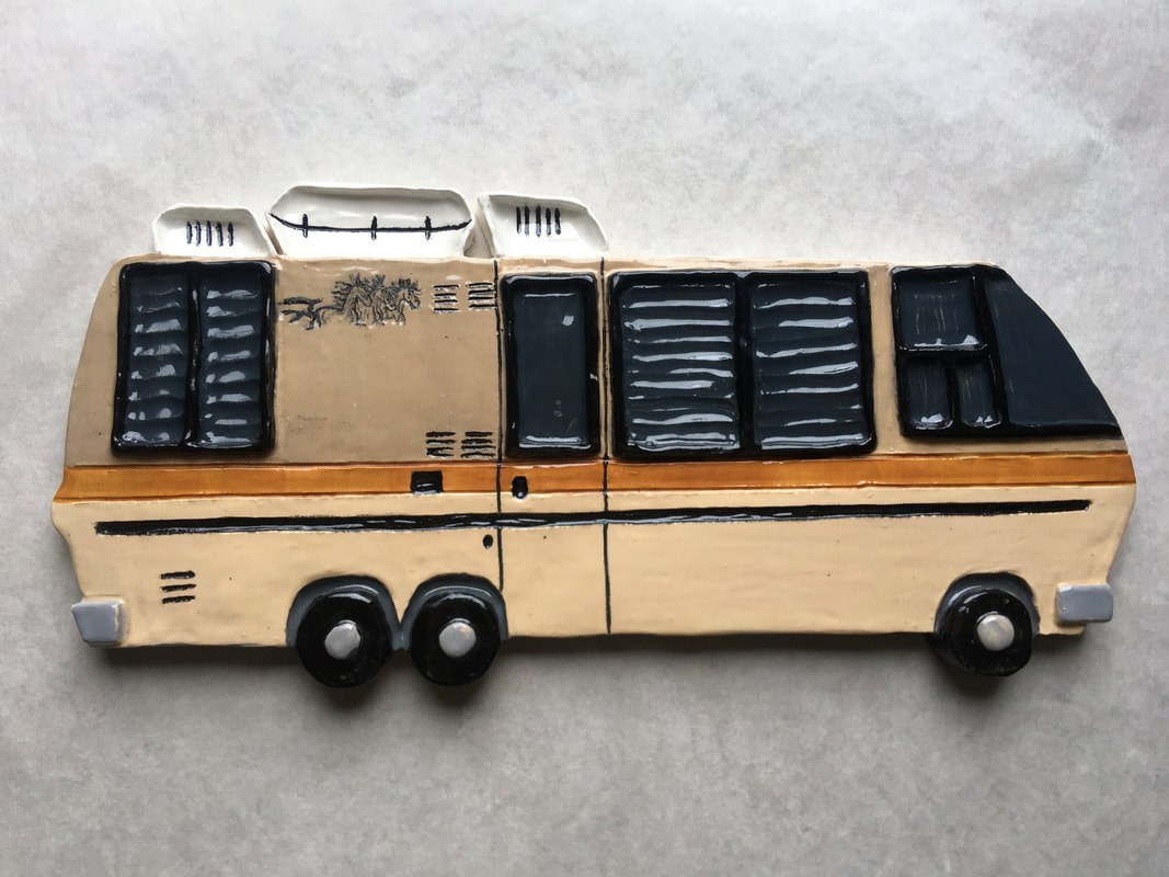
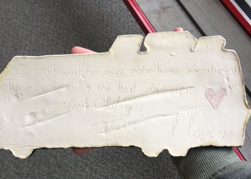
My artwork looks like someone with their head on their knees with their arms wrapped around them sitting on their bottom. It is all black with different mean words written all over the figure. I got my inspiration on how to shape it when I looked up, "person with head on knees" My artwork is made of white clay. I used sgraffito as a technique to make the words. It is glazed in black underglaze and clear glaze. What inspired me to make this artwork were my feelings/emotions. I tried to show how someone can feel from time to time. Especially throughout this rough year. It has been hard for a lot of people and many struggle with mental health. I wanted to show how some people feel about themselves when they are feeling down. I don't know if I would want this artwork anywhere large scale. I like it small scale, it could maybe be in a therapist room or something. My goal as an artist is to learn new things and make the best art I am capable of. I feel like this reached my goal somewhat because I never made a person like that before. It was something new and different that I learned. When creating this artwork I learned how to make a person. The final piece is how I imagined it would turn out. Besides the mistake I made when craving out one of the words. This piece will influence future art works because now I know I can make things that I didn't think I could. This experience will help me get out of my comfort zone when thinking of new art works. Supplies/materials, White Clay, Needle tool, Bobby pin tool, Underglazes, Wax resist, Clear glaze, Underglaze pencil Making my dads motorhome took a lot of steps, but I learned a lot throughout the process. First I started by finding some white clay and rolled it out into a big flat slab. Then I made the outline of the motorhome with the tip of my pencil. The clay was soft so if I made a mistake I could just rub out the line and restart. Once I had the outline down I started making the details like the windows, stripe, wheels, and other parts of the motor home. I slipped and scored the edge of the windows to make it pop out. Next I made another slab and mixed up some underglazes. I tested lots of different underglazes out on the slab. I wanted the perfect colors for the motor home so this took a lot of time. After I found the perfect colors I started painting the underglazes on my motorhome. I added two layers of underglazes when I used darker colors and when I used lighter colors I had to do about four layers of underglaze. After I grabbed some wax resist and my test piece. I bruised wax resist on the slab and it was hard to put on because my paint brush got all sticky, the wax ended up being really thick on the clay and uneven. Thank god it was the testing piece though. After the wax dried I carved out random pieces testing out the technique. The wax was thick, so some of it peeled off. Once I finished carving I put black underglaze in the cracks and if I messed up the wax resist kept it from getting on the colors. I then fired my test piece to see how it would turn out. I came out pretty good other than the spots that the wax resist peeled when I was carving. I decided it was time to do my motorhome. This time when I used the wax resist I put two tablespoons of wax and one tablespoon of water. This helped a lot. It really thinned it out and made painting easier. I also used a brush that was more hard so it wouldn't clump. Doing these little things differently made the process much easier. After the wax resistance dried on my motorhome. I started carving but found none of my tools were small enough so I used a needle tool and that worked perfectly. I also carved on the back, “I can’t wait for more motorhome adventures! Thanks for being the best dad ever. I love you.” After I finished all of the carving I put black underglaze in all of the lines I carved. It worked out really good. If I messed up I slippy whipped off the black. Once I finished the long process I set my motorhome on the shelf to dry. I went and grabbed my test piece that was fired. I put clear glaze on it to see if it would change any of the colors on my motorhome. When it came out of the kiln it looked really good and all the colors turned out perfect. I loved the shine effect the clear glaze gave it. I then fired my motorhome and it came up looking really nice. The next step was to put on the horses. I used an underglaze pencil for this and it was somewhat hard because you can't erase it. I just went for it and drew the horses. They look kinda stupid but I still like them. Then I put clear glaze on my motorhome and fired it. It came out perfect. All the colors darkened well so it matched my dad's real motorhome. I am really happy with the overall artwork and I can't wait to give it to my dad for his birthday.
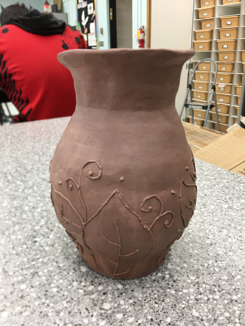
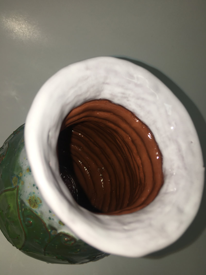
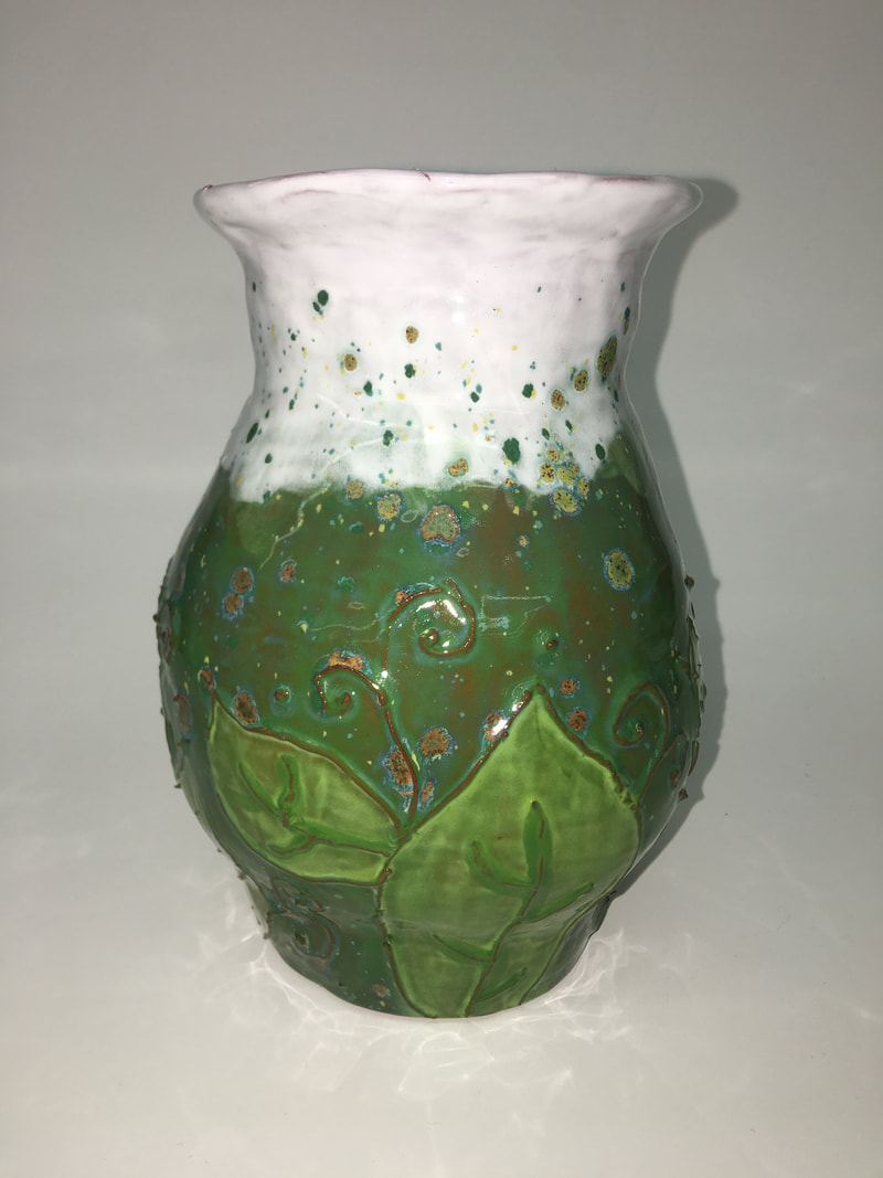
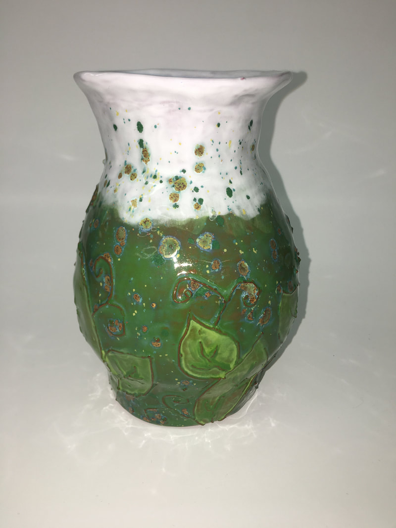
When creating my relief tile I used two studio habits of mind. The first one that I used was express. Express is creating artworks that convey an idea, feeling, or meaning. My relief tile is my dad's motorhome. I wanted to make him something special because I think he gets jealous when I bring home pots for mom. So I decided to make his motorhome. The motorhome brings our family together because we can drive all the way to Winona and spend time with Ashlyn, me and dad can have sleepovers, it can be a quiet place to work on homework or take naps. I wanted to make an artwork that meant something and this one does. The next studio habit of mind I used was stretch and explore. The motorhome had a lot of fine details and I needed a technique that could help me with those fine lines. I decided to learn how to use wax resist. Wax resist is something that underglazes can be wiped off of. Once I finished the base color of my motorhome. I put a thin layer of wax over the top. Then once the wax dried I carved away fine details. Then I painted in the carved lines. If I made a mistake with the black underglaze I could just wipe it away because the wax resists the underglaze. The underglazes I used were teddy bear brown, ivory beige, deep yellow, white, electric blue, and black. I had to mix different underglazes to get the colors I wanted. Once I fired the motor home with underglazes I then put a clear layer of glaze on the whole thing. In between clear glaze layers I drew on the horses on the side of my dad's motorhome. When creating my coil vessel two studio habits come to mind. The first one is reflect. When I started my coil pot I new that I wanted to make a vase for my grandma. I first started out rolling out the coils, which for me was one of the harder things to do. The coils never really come out how you want them and sometimes they just keep cracking. Once I made the coils I started putting them together in the design I wanted. I was very very hard to keep the pot even. As you can tell in the picture it looks kinda lopsided so I spent a lot of time trying to fix that. After spending way to much time on trying to perfect it I just had to move on. I wasn't sure how I want to decorate my pot so I look up a few things and nothing really sparked my interest. I just decided to make up my own design. I also used a new technique called slip trailing. I thought it was fun, but sometimes the consistency of the slip was hard to work with. Once I finished that I went looking for glazes. I knew that I didn't want it to be to "busy" at the top of the pot because I wanted the flowers to be the main attraction. So I decided to paint the top white with white glaze. Next I found greens, the green glazes I used where new leaf and ivy green . I didn't have a technique when paint my pot I just kinda went with it and put glaze all over. Once all the green dried I put the color brust herb garden over the whole thing. That color burst is probably one of my favorites and I think that it really brings the pot together. The next studio habit I used was engage and persist. I had a lot of problems when making this pot and I took a lot of me not to just pick it up and chuck it at the wall. But I pushed though and kept with it.
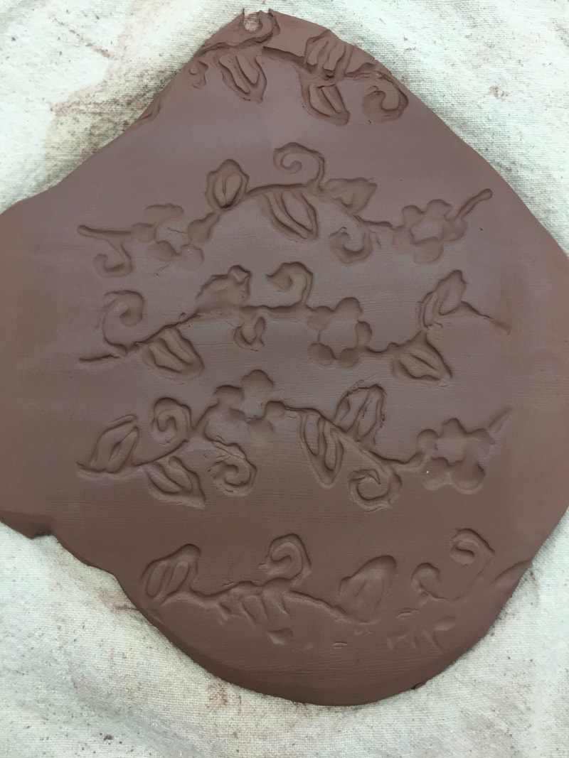
When making my slab box I used two studio habits of mind. The first studio habit I used was engage and persist. This is because I had a lot of problems while making my slab box but I learned to embrace them and keep moving forward. The first mistake I made was not pressing hard enough into the clay to make the texture roller design. I had to take a whole day to carve out the design better. Another mistake I made was when I forgot to put a coil role in the inside of my slab box. So I had to try and fit my fat hand in the slab box so I could put the coil in the corner. The second studio habit I used was stretch and explore because I used a new technique when glazing my slab box. I put white glaze all over the vine designs. I was really messy with the glaze because I just wanted the vines to be white (As you can see in one of the slide show pictures) Then I put the box under water to wash off all the extra white glaze I did not want on the box. I just wanted to have white on the vines so that is why I used that technique. After I finished with the white glaze I put on a glaze called blue caprice, which is a color burst glaze. I like how my box turned out. It is going to be used in the greenhouse for all of my moms gardening seeds. When making my texture roller I used two studio habits. The first one I used was engage & persist. When I was putting hot glue on the texture roller, it would not go on how I wanted it to. I kept messing up because the glue would either come out to fast or it would come out as big globs. I soon learned how to pace myself when putting the glue on and I carved away glue that I did not like. I also used the studio habit reflect. I first grabbed my white tub and then thought about what I would like to. I knew that I wanted to do a nature design. I then decided to do some vines with flowers and leaves on it. Once I drew my design on I started hot gluing. Once I finished that I carved away the pieces of hot glue that I did not like. I like the way that my texture roller came out.
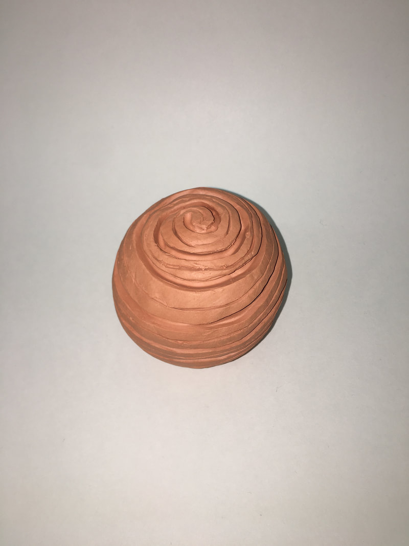
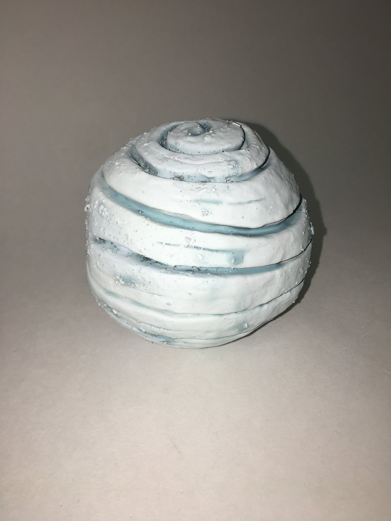
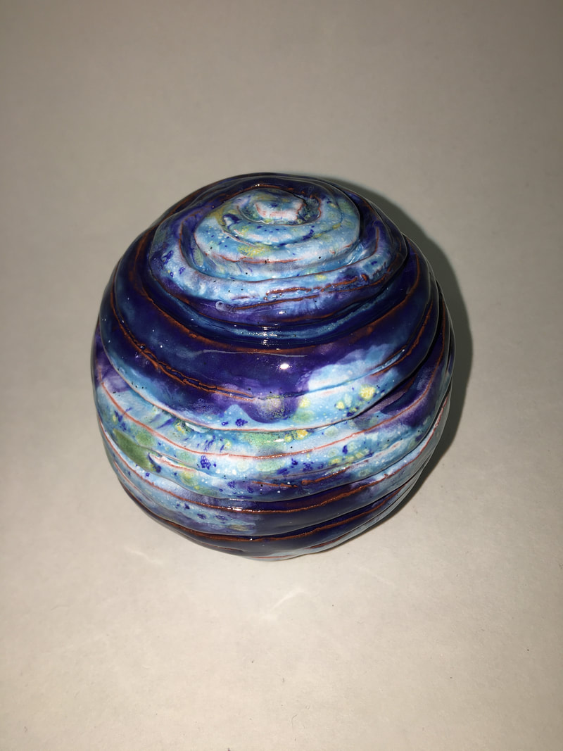
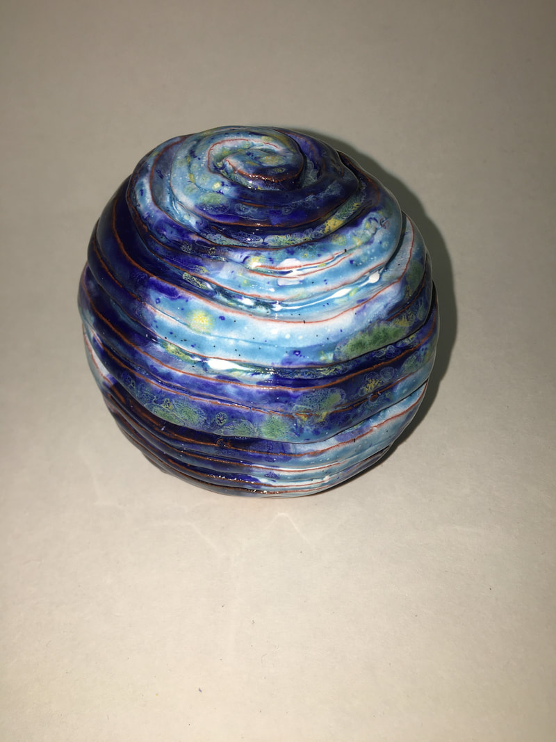
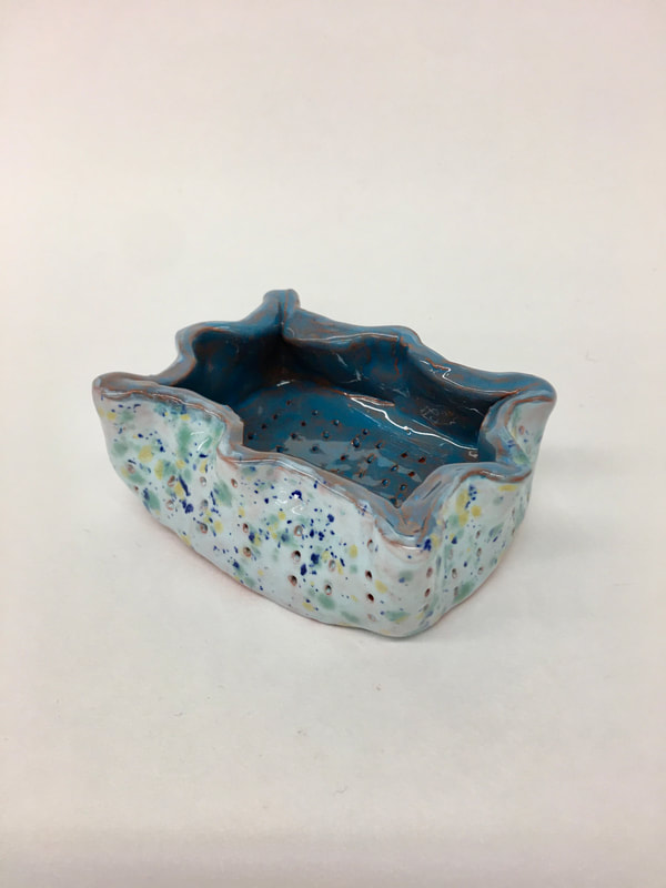
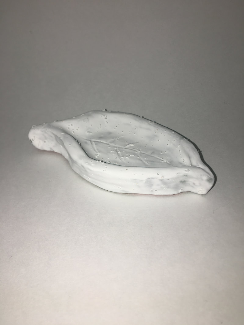
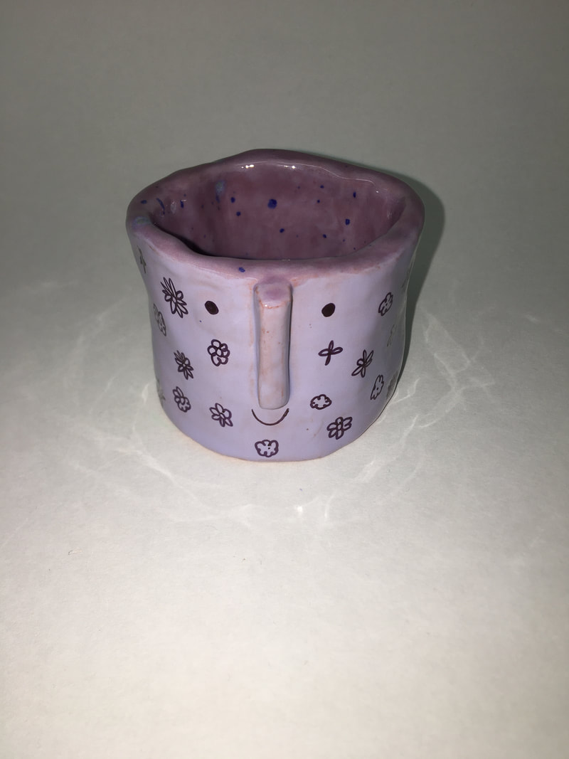
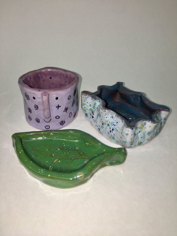
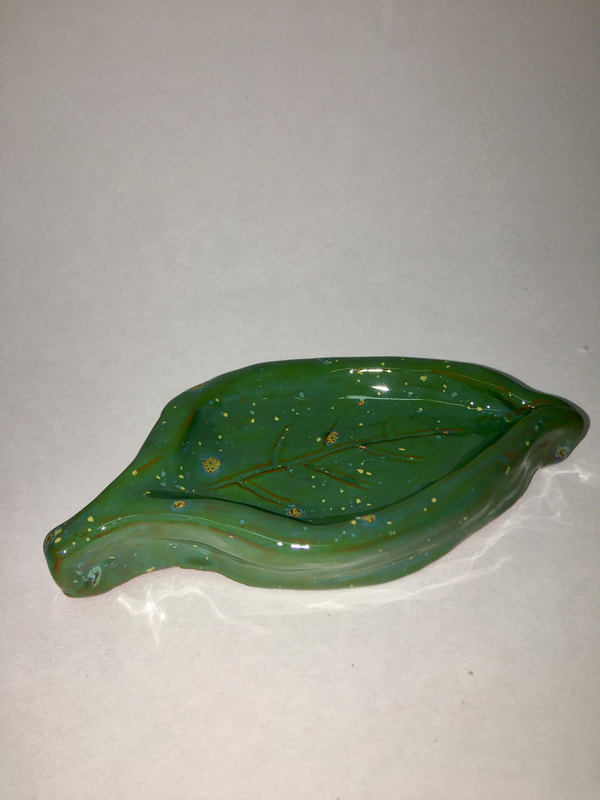
When I was creating my sphere I did two studio habits the first one that I used was engage and persist. I learned to embrace the problems that came my way when making the sphere. The first problem that I came across was when I put the two halves of the sphere together it looked like an egg. I was going to redo it when someone told me to just roll it round my table and that should fix it. Which it did. Another problem I had was when I was carving out my sphere little clay buggers kept getting stuck and in my way. It was very annoying, but I just had to keep trying my best to move them out of the way without wrecking my design. The second studio habit I used was envision. I envision how I had to make the sphere so it would be successful. I also envisioned how I wanted to the glazes to look on the sphere. I wanted the glazes to look really cool because my design was a bit boring. I think it kind of looks like some sort of planet far off into the galaxy. The glazes I used where white, blue caprice, tahiti, mosaic blue, and grape. I really like all of the glazes and I will be using them again for sure. When creating my pinch pots I used two different studio habits. The first one is express because I learned to create a pinch pot that conveys an idea. This pinch pot is my leaf. The leaf pinch pot to me expresses spring time when everything starts to turn green. My mom and I go on walks in the spring time because it's so nice out and everything starts to get color again. The second studio habits is develop a craft. I used develop a craft when I was trying out all sorts of glazes. I wanted to find out which glazes I liked best so I tested out all sorts of combinations. Here are all the glazes I used for each pinch pots. Leaf: I used ivy green for the base and put herb garden over the top. At first I wasn't going to use herb garden but when my leaf came out it looked boring. I then decided to added herb garden over the top and that looked way better. Purple pot with face: I put lilac all over the pot and then I put berry berry pie on the inside. I used these colors because I want to give this pot to my sister and purple is her favorite color. Curvy rectangle pinch pot: I used tahiti blue on the inside and on the outside I used light blue and put seawind over it. |
AuthorHello, my name is Arika. I like tacos, sports, art, and animals. My cover page is my dog izzy. :) Archives
June 2021
Categories |


 RSS Feed
